  What I did for this Assignment:In tech class this week, I learned about how to add images to a Neocities website! Overall, this assignment was more challenging to me compared to if you only add links or make text bolded. I had a little bit of trouble with the sizing of my images but it wasn't too bad! Personally, this wasn't my favorite thing to do on Neocities but I enjoyed learning about it! Here's a link to my website: LINK. If you enjoy graphic design and creating things online, I recommend trying this!
0 Comments
  What I did:This week in tech class, I learned more about adding links to a website. For this assignment, I added a total of 7 different links, 4 of which I often use and 3 from Neocities. This assignment was challenging, but in a good way and it wasn't too hard. Overall, I've really enjoyed learning more about how to create a website on Neocities! Here is the link to my webiste: LINK
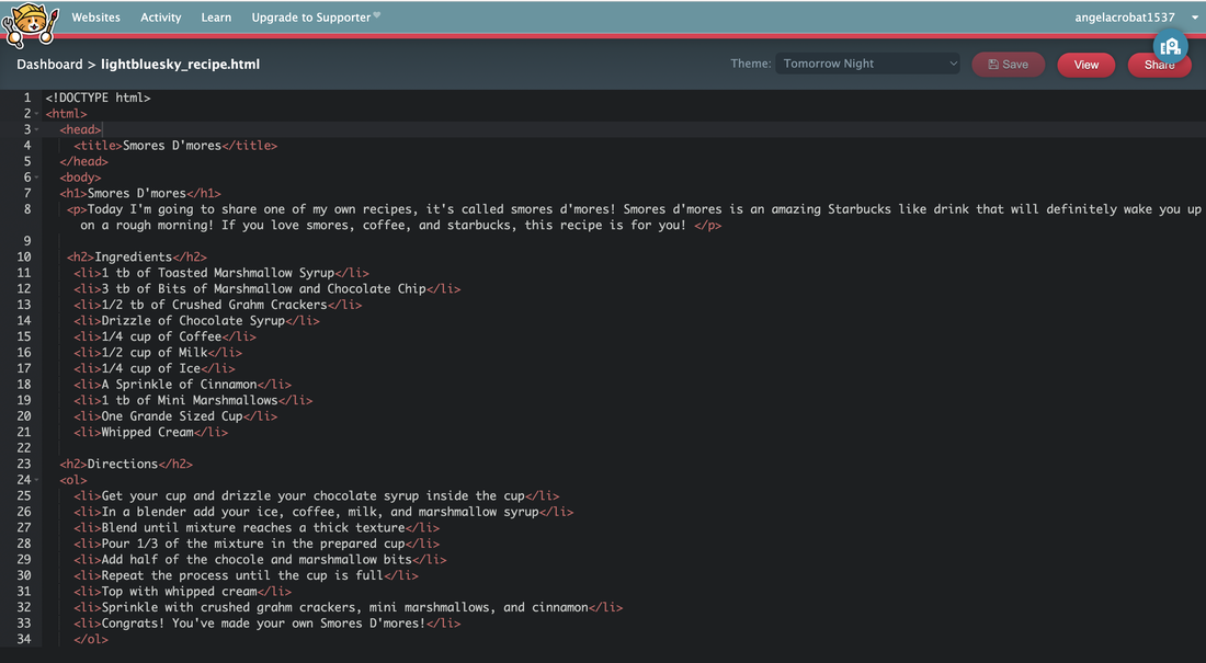  My Experience:Overall, my experience was pretty good! I really enjoyed this lesson/mission and I thought that it was challenging but in a good way. I think my favorite part was definitely coming up with the recipe. Personally, there wasn't really anything that I found "challenging" about this assignment, I found it quite enjoyable! If I had to pick a challenging part, it would've definitely been trying to make sure that everything is aligned. If you enjoy graphic design and creating web pages, I would definitely recommend trying this!
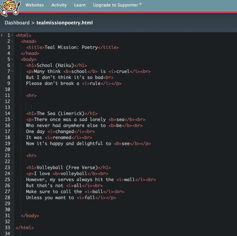  My experienceOverall, my experience with this assignment was quite good. I thought that it was slightly challenging but in a good way and that it was a good experience. Personally, I don't find coding the most enjoyable but my experience with this assignment wasn't terrible. Yes, I ran into occasional issues from time to time but I found a way around them and always fixed any problems. I think the hardest part of this assignment was learning how to create the website all on my own, because this was my first time ever doing anything like this without close "guidance/help". Here is the link to my finished website (LINK). In general, this assignment was quite fun, and I enjoyed it!
This week in tech class, we were supposed to create three logos and create three different variations for each one. For me, the most frustrating and challenging thing for me was vectorizing the logos, this was challenging for me because it was hard to make certain lines and fonts exactly the way I wanted. However, my favorite thing about the process was changing the color combinations and making each one slightly different. Something that I learned from this, is that it's quite hard to recreate something that was once on paper and changing it to be digital. This was hard for me because some of my logos were quite complex and it was hard to make everything the same. For example, some lines were hard to recreate, but in the end I think it turned out okay. 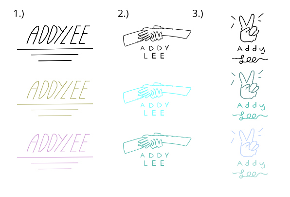 Although it's quite clear, the name of my brand is "Addy Lee" (my name). The purpose of this brand is to support positivity, compassion, inclusiveness, and much more. The identity of the brand is respected, high quality and always willing to help. The logo that I've chosen (screenshot below) represents the brand because it shows that the brand is compassionate and always willing to help. The logo that I've chosen is my favorite because I like the color scheme and the simple design. I like the subtle color scheme because it's not too colorful and flashy, and I like the simple design because it's not too loud and it looks elegant. The design process was quite tedious, but I had a lot of fun designing these logos, I'm not sure if it's something that I'd do in my free time, but I recommend it if you enjoy graphic design! 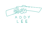 This week in Tech class, I learned about logos. For my logo, I decided to create a "brand" for my name. This brand is supposed to be compassionate, sophisticated, hardworking, and much more (represents me). Out of the fifteen logos I drew, I picked the 2nd one, the 9th one, and the 11th one. I picked the 2nd one because I like that it's simple but still sleek. I picked the 9th one because I like the hands and the font, I think that it looks very compassionate and caring. Finally, I picked the 11th one, because personally I love the peace sign (I use it a lot for pictures) and I like how it's still simple but elegant. The 2nd one represents that the brand is important, but there isn't really an image to symbolize anything. However, for the 9th one, the logo represents that the brand/my brand is caring and compassionate (that's what the hands symbolize: helping each other). For the 11th one, the peace sign just represents the brand because it's one of my favorite signs (I think it looks visually appealing). I like most of them! But, I don't really like the 3rd one (looks too busy) and the 7th one. While I was working on these logos, it definitely took me a long time and pushed my drawing skills to their limits. I think I spent around 2 hours total just drawing the logos. However, I'm not a huge fan of drawing, so this process wasn't exactly "fun" for me in my opinion. In conclusion, I had a lot of fun learning about logos, but not exactly designing my own, if you're a fan of drawing and designing, I think you'd enjoy this! 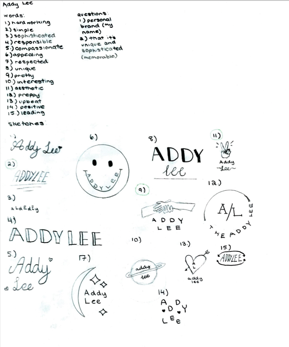 Over the past two weeks of tech class, I've learned about RGB, hex codes, and color in general. Some challenges I faced when completing my two assignments (Color names & Color schemes) were making sure to use C.R.A.P (making sure things were aligned, proximity, etc.) and finding certain hex codes and RGB's. I was able to overcome these challenges by using a color wheel and by using the tools provided in Corel Vector to align things. Some successes I believe I achieved are finding a good mix of Analogous, Triadic, Monochromatic, and Complimentary colors and making sure things are aligned. To make finding color schemes that I like easier, I used this website called Adobe Color which made finding different color schemes so much easier! If you want to find hex codes and RGB's to certain colors and color schemes I recommend this website! One thing I'm proud of that I accomplished over the course of these two weeks is being able to identify a hex code and RGB. Before any of this, I barely knew about colors and would always just use the pre-made colors, but by learning about RGB and hex codes, now I know how to create certain colors. Some tools I used when creating my pieces in Corel Vector are the pen tool, shapes, and text boxes. There wasn't necessarily a concept behind my pieces, other than the fact that I chose to do all hearts. For the first assignment I just used a heart from Corel Vector found in the shapes section while for the other heart I used this picture as inspiration. My favorite color scheme out of the four that we talked about during class is monochromatic because personally, I prefer when a set of colors is around the same color. Because of this, my least favorite color scheme is complimentary, because I don't like how different the colors are. In conclusion, I had a lot of fun learning about different colors and color schemes and I can't wait to put these skills into use! Color names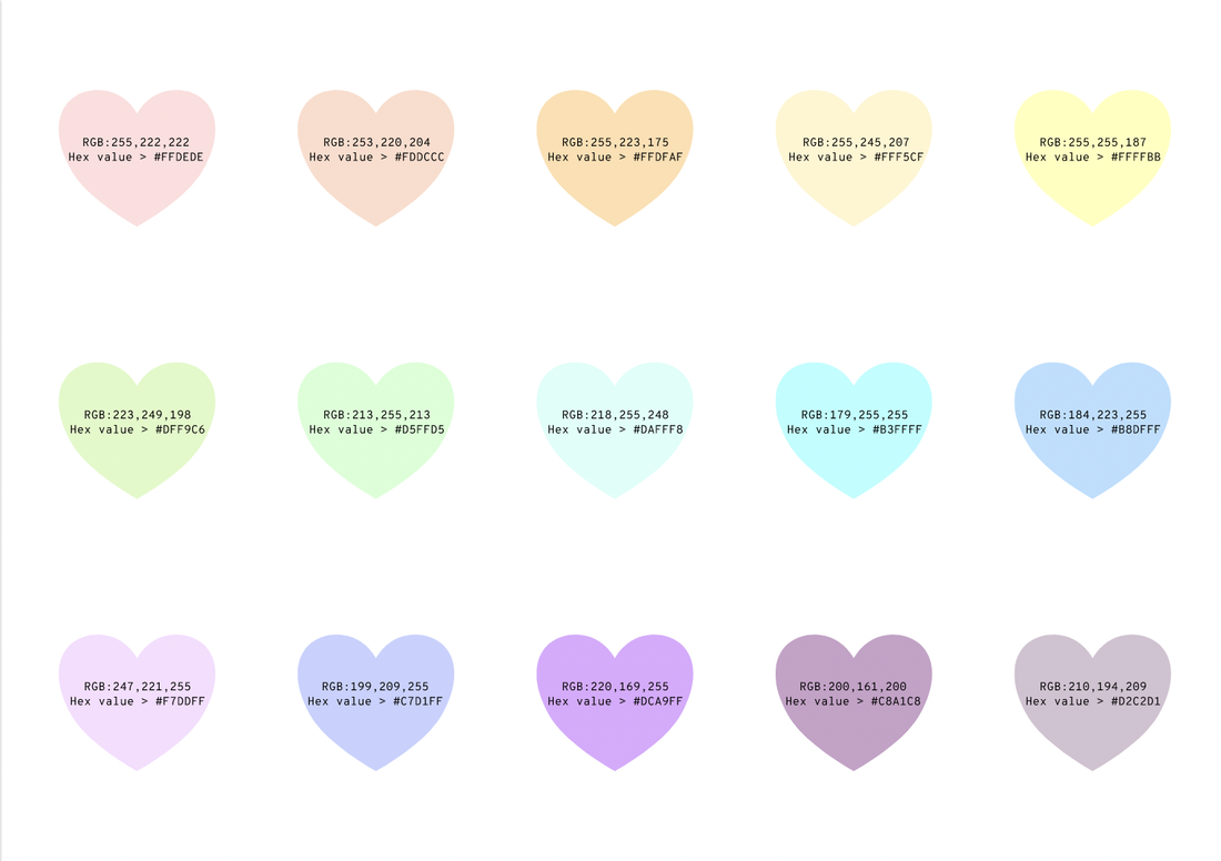 Color schemes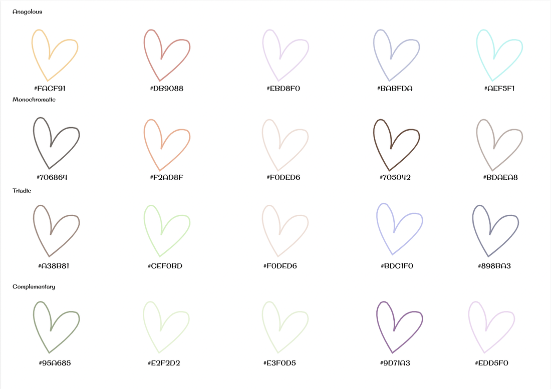 This week in Tech class, I learned about Typography. Typography is the visual component of the written word (according to M. Butterick). Typography is important because people may judge something based on how it looks, having nice fonts/using good typography can help you communicate your ideas to your readers. The quote "Each font has a personality and a purpose" means that all fonts were made for something unique, and you should only use certain fonts for certain things because they may communicate different ideas. The five main fonts that I learned about this week are Serif, Sans Serif, Monospaced, Script or Handwritten, and Display. Serif fonts have "feet", and should generally be used in large blocks of text or print. Serif fonts are also commonly used for books Sans Serif fonts on the other hand, don't have "feet" and should usually be used on the web and for title, headlines, and smaller chunks of text. Monospaced fonts are quite different in the way that each letter is evenly spaced and takes up the same amount of space. Monospaced fonts should usually be used for coding, but they don't work well for large blocks of text. Script or Handwritten fonts can be cursive, handwritten, or calligraphic, but sometimes they can be a challenge to read, for this reason, Script or Handwritten fonts are best used for logos, large headlines, or even small details. Finally. Display fonts are good a grabbing attention but should be used sparingly, for this reason, the popularity comes and goes. Display fonts should be used for titles, logos, etc. Typerface ComparisonThis Assignment was the first assignment after learning more about Typography. For this assignment, I was assigned to find five different fonts (one Serif, one Sans-Serif, one Monospaced, one Script or Handwritten, and One Display font). After finding the five fonts, I then wrote one sentence and typed it out in each font. Here's my finished result for the Typeface Comparison assignment!  Word portraitsThe second assignment for this unit was called "Word Portrait" for this assignment, I was assigned to find 10 different fonts and with each font find one word that suits the font and one word that doesn't fit the font. Just like the assignment stated, I did exactly that. My example is included down below!  This week, I learned about javascript and drawing with code. I decided to make a Christmas tree in a winter wonderland (due to the fact that Christmas is coming up very soon!). I learned about a type of coding called "javascript" where you can create your own drawings with code! From creating this picture, I learned that in life you have to fix things for it to be "accurate". Meaning that if you fail at first, you can learn from your mistakes and improve just like this code. If something wasn't "perfect", meaning that it wasn't the right color, dimensions, or in the right placement I would learn and fix it. If you're interested in learning more about javascript I recommend that you try using Khan Academy! Click here to try out the KhanAcademy tutorials yourself! 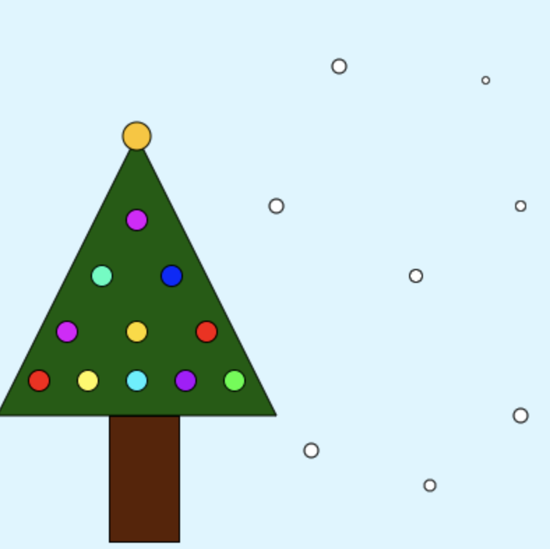 My Code
Over the course of two weeks, I learned about the pen tool feature from Corel Vector. The first assignment was to trace super hero logos, the next was too cut out Abraham Lincoln from a penny image, and the third was to create some masterpiece with the pen tool. The pen tool is a special feature that lets you create whatever shape you want. In my final summative, I decided to use 2 pictures that I took and put them together with one other picture. The heart-hands was a picture I took with one of my friends at a basketball game while the other picture (the canyon inside the heart) was taken also by me while horseback riding while the other picture was this picture. At first, the pen tool was quite difficult to use, but after learning about a new technique through the penny exercise it became much easier. I learned that instead of creating the curves and shapes while making the shape, you can do it after. Personally, it made using the pen tool much less complex and much easier. Over these past two weeks I've learned a lot about the pen tool and it's been quite fun! I hope to continue getting better at using the pen tool in the future!  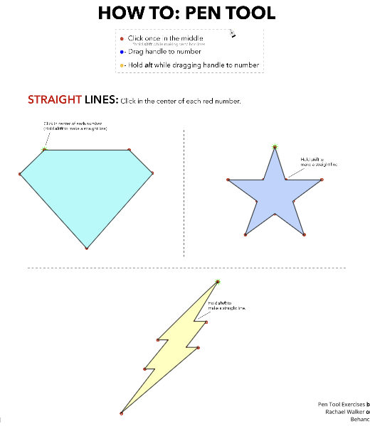 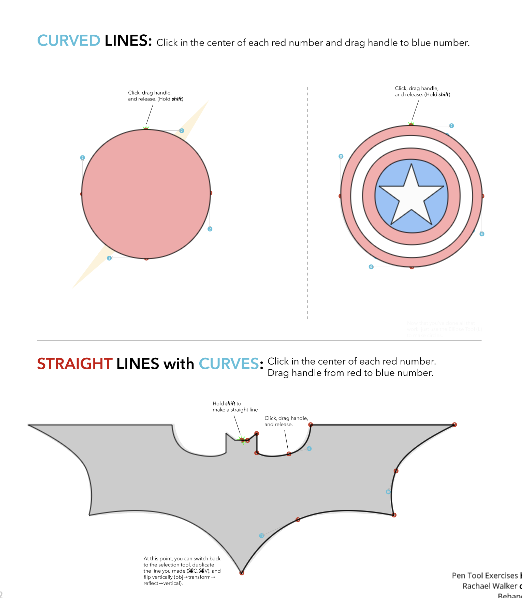 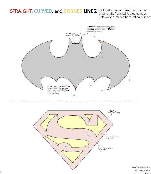 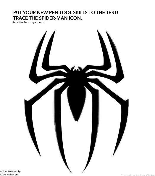 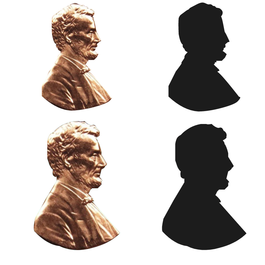 |
ArchivesCategories |
 RSS Feed
